Duration 1 month approx.
These courses are being updated with artificial intelligence. We try to stay at the front of what AI can do: the tools change, and the syllabus is revised so that what you learn still holds when you publish.
Added to the cart. See the final price.
Lienzo is the visual design course applied to a website. It is not about decorating a template or stacking effects. It is about the site being recognisable as the business it belongs to: the same colour, the same type, the same order, the same voice. You arrive with an existing brand or with a business that still has no graphic rules. In both cases you build a small system that can be used on a real page, not a forty-page brand manual that nobody opens.
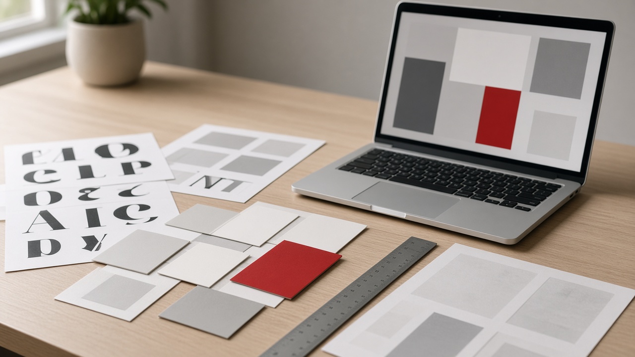
Colour is worked with few values. A main colour, a neutral for the text, a background and, if it is needed, an accent. You learn to measure the contrast between text and background so a paragraph can be read in sunlight, on a phone, and by someone who does not distinguish certain tones well. Grey on grey is left out, as is white text over a photo with light areas, and gradients that cover the content. Each colour has a job. Red, for example, can mark a link or a button, but it cannot sit at the same time on headings, backgrounds, icons and rules, because then it points at nothing. The codes are written down and used every time, instead of picking a similar tone each time the file is opened.
Type is limited to one or two families. One for headings, with a weight and letter-spacing that can be read in short capitals, and another for running text, with a size and line-height that do not force anyone to lean into the screen. You see what happens when the heading is huge and the paragraph is tiny, and what happens when everything is the same size: the first case has too much hierarchy, the second has none. You practise ordering a real block — a service, a price, an address — so the eye knows where to start. Bold is kept for the fact that has to be found, not for stressing every sentence.
The image is chosen and cropped with a reason. A photo of the premises, the work or the product is worth more than a generic stock beach that could be any island. You learn to frame, to keep essential text off the photo, and to export a file that weighs only what it needs to. An icon, if it is used, has to say something the text does not already say, or to accompany a list without becoming decoration. Alignment is checked: equal margins, columns that start at the same point, buttons of the same height. Visual disorder is usually a disorder of measurements, not of style.
In a week you close a home page with a palette, type and a clear hierarchy. In fifteen days the same system is applied to two or three pages, and you correct what does not hold when it is repeated. In a month you leave a short guide: colours, sizes, and examples of a heading, a button and a photo, enough so the next page does not start from zero. Lienzo does not train illustrators or campaign art directors. It trains someone who has to leave a website coherent, recognisable and easy to read, and who will then maintain it without trying a new colour every week.
 Español
 English